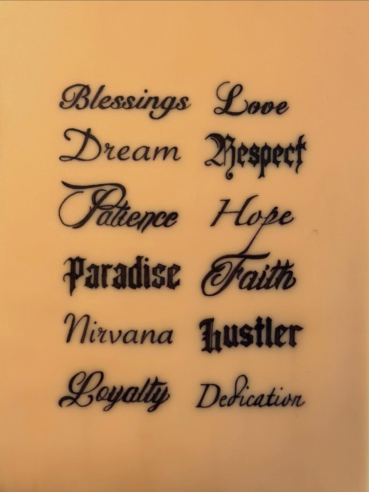
The 7 styles below range from bold traditional flash to flowing cursive script, and the right one depends less on which image you saved than on how much you move the body part underneath it.
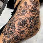
A realism piece needs custom drawing every time because the letters must respond to light the same way the surrounding roses or palms do.
1. Traditional Tattoo Style Words
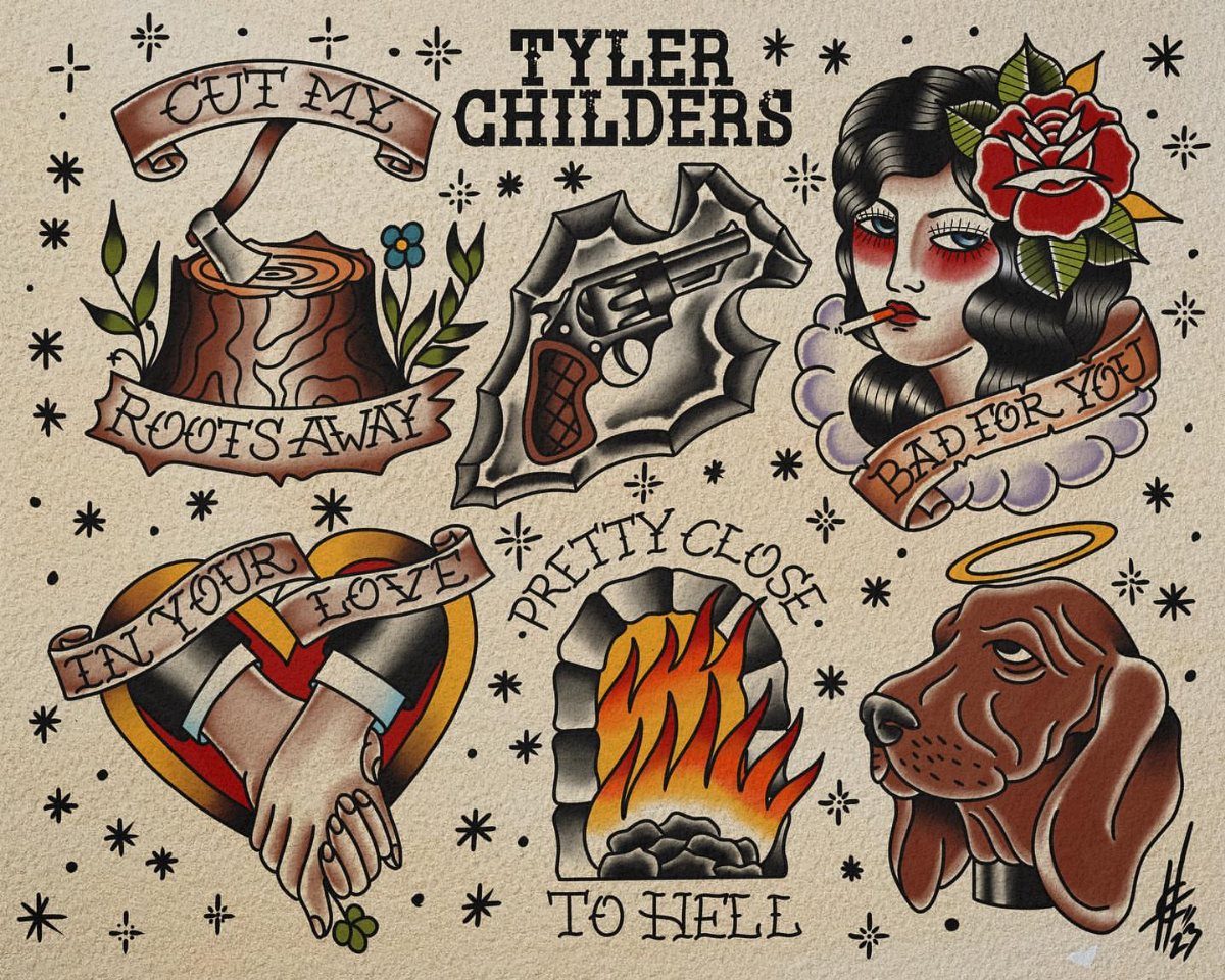
Traditional tattoo style words carry the weight of a format that has lasted since the first American flash sheets.
Bold outlines and a limited color palette keep text readable at small sizes and from a distance, which matters if you want words that still scan clearly decades later.
Before committing, check that your artist actually works in American traditional, not just "traditional-inspired."
The banner shapes, the specific curve of the lettering, and the way text locks into the image around it are skills that separate a flash specialist from someone who downloaded a font pack.
Ask to see healed photos of word pieces, not just fresh ones; the black in traditional work should stay dense, and the red should not muddy into the skin around it.


2. Realism Tattoo Style Words

A realism tattoo of words sits inside a scene rather than floating on top of it.
Cursive lettering can share space with roses and palm trees without either element winning; matching the shading on the letters to the shading on the objects makes the word read as part of the same visual world.
This style demands an artist who can draw letters freehand and shade them like skin, fabric, or metal depending on context.
Do not bring a font file and ask for it to be tattooed in realism; the letters need to respond to light the way the surrounding image does, which means custom drawing every time.
Check that your artist’s portfolio includes at least 3 healed word pieces in black and grey, since fine detail in realism can blur over time if the saturation is too light.

Unique Design Christian Temporary Tattoo: Yazhiji Christian tattoos serve as a modern testament to timeless faith-based imagery, Styles like blackwork, traditional, and black and grey realism are particularly suited to this tattoo idea, emphasizing the solemnity and importance of the symbols, Common placements include the forearm, chest, and back, areas large enough to accommodate the intricate details of biblical scenes or the solemnity of crosses.


3. Watercolor Tattoo Style Words

Watercolor tattoo style words let the pigment do what paint does: bleed, pool, and fade at the edges.
The soft edges that make this style striking are also what make it risky. Watercolor tattoos without any black line to hold them can fade into a smear faster than lined work, especially on arms that see sun.
If you want the watercolor look to last, ask your artist to lay a hair-thin black outline under or around the letters, invisible at first glance but enough to keep the text from dissolving into the color field around it.
Healed photos matter here more than in almost any other style.

★【18 Sheets 200+ PCS Small Finger Temporary Tattoos For Women Men Adults】--COKTAK Brand Mixed Style Black Small Temporary Tattoos For Men Women Adults Hot Fashion Variety Y2K Tiny Geometric Arrow Lotus Rose Flowers Leaf Leaves Sun Crescent Moon Butterfly Words Letters Finger Tattoo Stickers In One Package.


4. Fine Line Tattoo Style Words

Fine line tattoo style words run on needles grouped down to 1 or 3, drawing hair-thin strokes that sit close to the skin surface.
Restraint in fine line reads as quiet confidence; the text does not shout, and small decorative elements stay subordinate rather than competing.
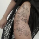
This style suits placement where bold work would feel like a billboard: the side of a rib, the inner forearm, behind an ear.
The cost of that delicacy is longevity. Fine line spreads over time, and letters with strokes as thin as hairlines can close up into solid shapes if the artist works too shallow or too deep.
Ask specifically about needle grouping and whether the artist plans to return for a free touch-up within the first year; many fine line specialists build this into the price because they know the medium needs it.

Massive Quantity: 60 Sheets in total of fake temporary tattoo stickers, including 30 sheets of inspirational and motivational quotes and scripts, cursive words, retro typewriter style sayinging, 30 sheets of simple branch flower tattoos. Enough for friends party gatherings to enjoy together or choose different pattern to match your everyday mood.

Sexy Phrase Thigh Tattoo Design: This semi-permanent tattoo set highlights a handwritten-style phrase “Heaven Sent” designed for bold and expressive placement. The flowing script creates a natural, body-contouring effect that enhances curves, especially on thigh, hip, or waist. Perfect for women who love confident, sexy, and statement tattoos that express personality and attitude with a clean yet eye-catching style.
5. Tattoo Fonts

Tattoo fonts are the one entry here where you start with type rather than style, then adapt.
Before you settle on a font, test it at the size you will actually wear.
Fonts designed for screens or print often collapse when reduced to skin scale; thin horizontals drop out, and counters (the holes in letters like O and A) clog.
Bring your chosen phrase in the font to a consultation and ask the artist to trace it at final size on paper first.
If you cannot read it from across a room, the tattoo will not read from across a room either.
Apps like Tattify or InkUp can preview text on a photo of your body, which helps but does not replace an artist’s eye for what will hold.

Tattoo Feather Flag Kit: this kit includes 2 tattoo feather flags, 12 ground stakes and 2 portable bags, saving you the stress of purchasing different components separately, so you have everything you need for your ideal display

4LessCo 2x4 Feet TATTOO Banner Sign Fabric Polyester With Gromemts

6. Handwritten Style Words

Handwritten style words preserve the irregular pressure and slight wobble of actual pen on paper.
Matching a photographed note exactly, down to the lowercase "i’m" and the spacing between words, gives a piece the feel of something traced from a letter someone actually wrote.
To get this right, you need the source material: a note, a card, a screenshot of a text.
Do not describe the handwriting and ask an artist to invent it; the charm lives in the specific flaws of one person’s letterforms.
Bring the original or a high-resolution photo, and ask whether the artist prefers to stencil it directly or redraw it while preserving the irregularities.
Some artists clean up handwriting too much and lose what made it personal; others leave it too rough and produce something that looks accidental rather than preserved. Ask to see one example of their copied handwriting before you commit.


Customize Now - Make It Yours: This personalized canvas wall art features an American Traditional Tattoo design where your custom couple names appear on the ribbon of a burning heart. Every element — daggers, roses, skull couple, love potion — tells a story of devotion, framed by the words "Always My Favourite Person In The Whole World Forever," turning your names into a timeless love declaration

7. Cursive Script Hand Tattoo
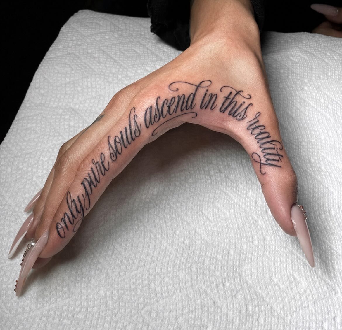
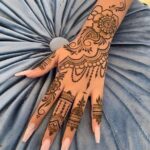
Cursive script on a hand lives in one of the most visible spots on the body and one of the most difficult to heal.
The skin here sheds fast, bends constantly, and takes sun without a break, so fine lines blur quicker than they would on a shoulder or thigh.
A cursive phrase along the thumb and index finger edge flexes every time you grip something, so the ink takes extra abuse there.
That movement works against crisp edges; the tattoo will need touch-ups to keep the letters from feathering. Ask your artist specifically about their policy on free hand touch-ups within the first year, since many charge extra for this spot.
Pain here is sharp and surface-level, more sting than deep ache, but the session is usually short enough to push through.
Aftercare is stricter than elsewhere: keep the hand out of water, avoid gripping, and accept that the healing will look rough longer than you expect.
If your job involves visible hands, consider whether you want this placement permanent or whether the inner wrist or forearm gives you the same script with less daily exposure.


Versatile Chest & Back Temporary Tattoos for Men & Women --- This tattoo sticker set contains 3 mens chest tattoos, 2 womens chest tattoos and 15 long strip temporary tattoos. Large core patterns measure up to 12in×7.48in, medium butterfly designs 11.2in×6.89in, long strip ones 9.25in×2.36in. Perfect for decorating chest, upper back, collarbone, waist and arm areas, unisex design fits diverse body parts to meet your personalized body art demands

Choosing the Right Tattoo Style
The style you choose sets how the piece will live on your body, not just how it looks the day you leave the shop. Bold traditional work carries across a room; fine line whispers from across a dinner table.
Match that reach to your own temperament and to the spot you have in mind. A quiet phrase behind an ear wants different handling than a chest piece meant to start conversations.
Placement changes the reading too.
Rounded surfaces like shoulders or thighs distort straight lines; flat planes like the forearm or outer calf keep text truer. If you move between extremes, a bold style forgives more than a delicate one.
Personality is harder to pin down, but it matters. Some people wear their ink like a favorite jacket, comfortable and present.
Others want it almost private, something that shows only when they choose. The style should fit that relationship, not fight it.

★【24 Sheets Large Pray Angel Temporary Tattoos For Adults】--COKTAK Brand Mixed Style Vintage Christian Religious Faith Family Themed Temporary Tattoos For Men Women. 【Size】Package Includes 12 Sheets 7.8"x3.7" Inches/19.8x9.6cm Large Temporary Tattoos For Arm Forearm Leg And 12 Sheets 3.86"x2.28 Inches/9.8x5.8cm Small Temporary Tattoos For Fingers Hands.


Skin Tone Considerations
Bold styles with solid black outlines show up reliably across every skin tone.
The contrast does the work; you do not need to guess whether it will read. Traditional, neo-traditional, and blackwork all operate on this principle, and the healed result stays legible for years.
Lighter styles shift the equation. Fine line and watercolor depend on the skin itself to provide the contrast, and they show most crisply on lighter tones.
On medium to deep skin, fine lines can soften or close up as they heal, and watercolor edges can disappear into the surrounding color field.
This is not a hard barrier, but it does mean finding an artist with healed results on skin like yours.
Realism demands the most adaptation. A portrait that builds depth through subtle grey shading on pale skin needs a different strategy entirely on deeper skin; the artist must shift how they place tone rather than simply adding more.
Color saturation behaves differently too. Bright pigments sometimes settle softer on deeper skin, or take an extra session to lock in.
Some artists build their whole practice around vivid color for exactly this reason; if that is the look you want, find one of them instead of betting a generalist will figure it out.
Ask to see healed shots on skin near your own, not just the fresh piece walking out the door. Fresh tattoos always lie about how they will age.

Total 720 pieces of small temporary tattoo stickers: Contains 10 pieces of Gothic English number tattoo stickers, a total of 720 pieces, 2 styles of English letters A-Z, 2 sets of 0-9 numbers. Adopt waterproof ink, durable and provide semi-permanent effect. You can have a personalized tattoo, painless. Sufficient quantity, you can customize the letters and numbers to become your own temporary tattoo of phrases or sentences

Massive Quantity: 60 Sheets removable temporary tattoo stickers, including 30 pcs of inspirational and motivational quotes and scripts, cursive words, meaningful sayinging and writings, 30 pcs of simple minimalist flower tattoos. Enough choices for friends outing, party gatherings to enjoy together or choose different tattoo designs to match your everyday mood.

Double Sided Tattoo Practice Skin: easy wipe, 2 sides designed fine line tattoo practice skins feature over 20 different stencil designs.
Artist Specialization Importance
Most artists have a style they do best, and the gap between their best and their second-best is wider than most clients expect.
A realism specialist and a traditional specialist are running 2 different operations even when the same machine is buzzing in their hand.
Filter the portfolio for your specific style, then check that the quality holds across different clients and different spots on the body.
One knockout realism piece swimming in a sea of unrelated work might mean a good day, not a dependable skill set.
Healed work tells the truth that fresh work conceals. Black lines that stayed dense, color that did not muddy, fine detail that survived the first year of sun and showers; these are what you are actually buying.
A good consultation includes pushback. An artist who nods along to every detail you describe without pushing back or offering alternatives is either hungry for the deposit or too green to know what falls apart.
The better ones ask about your daily movement, your sun exposure, your healing history, then propose adjustments that keep your idea intact while making it work on your body.


Package: this kit includes a 12 ft x 2.5 ft feather flag, 1 set of flag poles and 1 ground stake, as well as a flag pole storage bag; The ground stake and pole is about 4.5m in total; According to 15ft, the part exposed above the ground can be marked as 4m +; This set can be applied on grass or dirt

“Vacuuming Sucks” cleaning humour featuring a vintage upright vacuum, red roses, flying swallows and cream scroll banners. A sarcastic housework pun with classic tattoo attitude.
Frequently Asked Questions
What are styles of tattoos called?
The most common named styles include Traditional, Neo-Traditional, Realism, Blackwork, Watercolor, and Fine Line. Each has its own rules for line weight, color use, and how the image sits on skin.
Old-school Traditional and its newer cousin both lean on thick black outlines and a handful of solid colors, while Realism stacks layer on layer of gray-wash shadow until the image looks photographic, and Fine Line pushes a single needle or a tight trio to lay down strokes barely wider than a hair.
What style of tattoo is wording?
Typography tattoos are the common term for wording as a dedicated category.
In practice, words get folded into other styles rather than standing alone: a traditional banner, realism letters shaded like objects around them, fine line script, or watercolor text held by a hair-thin black outline.
The style you pick determines how the words age and how far they read.
What are some words related to tattoos?
Knowing the lingo helps when you are talking to an artist or reading reviews: needle grouping tells you how many points hit the skin at once, saturation measures how solid the black looks, counters are the enclosed holes in letters like O and A, flash sheets are the pre-drawn designs on the wall, blackwork means large fields of solid ink, and healed work looks nothing like the photo taken fresh out of the chair.
It also names tools and processes like stenciling, freehand drawing, and touch-up policy. These are the words that matter when you are discussing a piece with an artist rather than browsing for a phrase to ink.