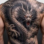
Chest tattoos for women run from a quiet 5/10 on the upper collarbone to a grinding 8/10 down the sternum, and the deciding factor is how close the needle sits to bone.
The soft tissue near the shoulder lets you sit longer and heal easier; the sternum demands a day you can lie completely flat without shifting.
That pain gap, 5 to 8, is the whole reason I separated these 9 ideas by placement first and design second.
1. Floral Tattoos
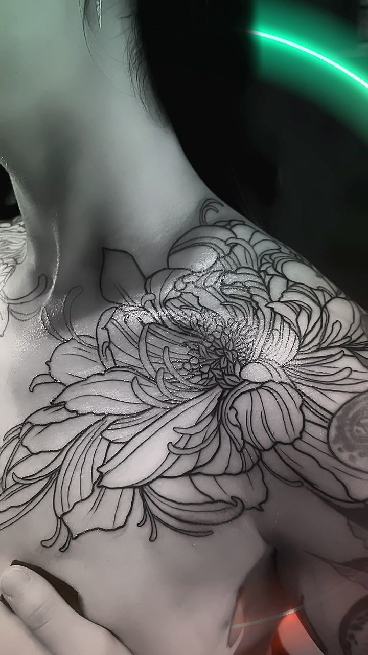
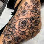
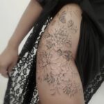
A chrysanthemum or peony blown across the collarbone and shoulder reads as one continuous gesture rather than a pinned-on shape.
The chest rewards this kind of flowing, organic layout because the body underneath it moves; stems that follow the muscle keep their proportions when you raise your arm.
Botanicals here age better than scatterings of small separate flowers, which tend to blur together once the skin starts shifting.
Ask your artist to work mainly in black ink with the lightest gray shading for depth; color in this zone fades unevenly from sun and friction.
I like this placement for a first chest piece because it heals openly, away from bra lines and sternum bone.

RICH TEMPORARY TATTOO KIT - Contains rich tattoos pattern templates (126 designs),6 tattoo inks in 2 colors (black and brown),4 disposable gloves 1 pack of cleaning supplies,allowing you to easily create unique personalized tattoos

【 575+ Fun Assorted Tattoo Stencils 】-The ChurlChurl tattoo stencils collection includes 575 high quality stencils with multiple themes. enjoy cute trendy tattoo stencil designs like butterflies, words, flowers, symbols, totem, Egypt style patterns and more.

▶ Henna Tattoo Kit: 16 sheets tattoo stencils. airbrush tattoo stencils suitable for tattoo lovers. Experience the effects of tattooing without the pain of tattooing.
2. Sternum Tattoos
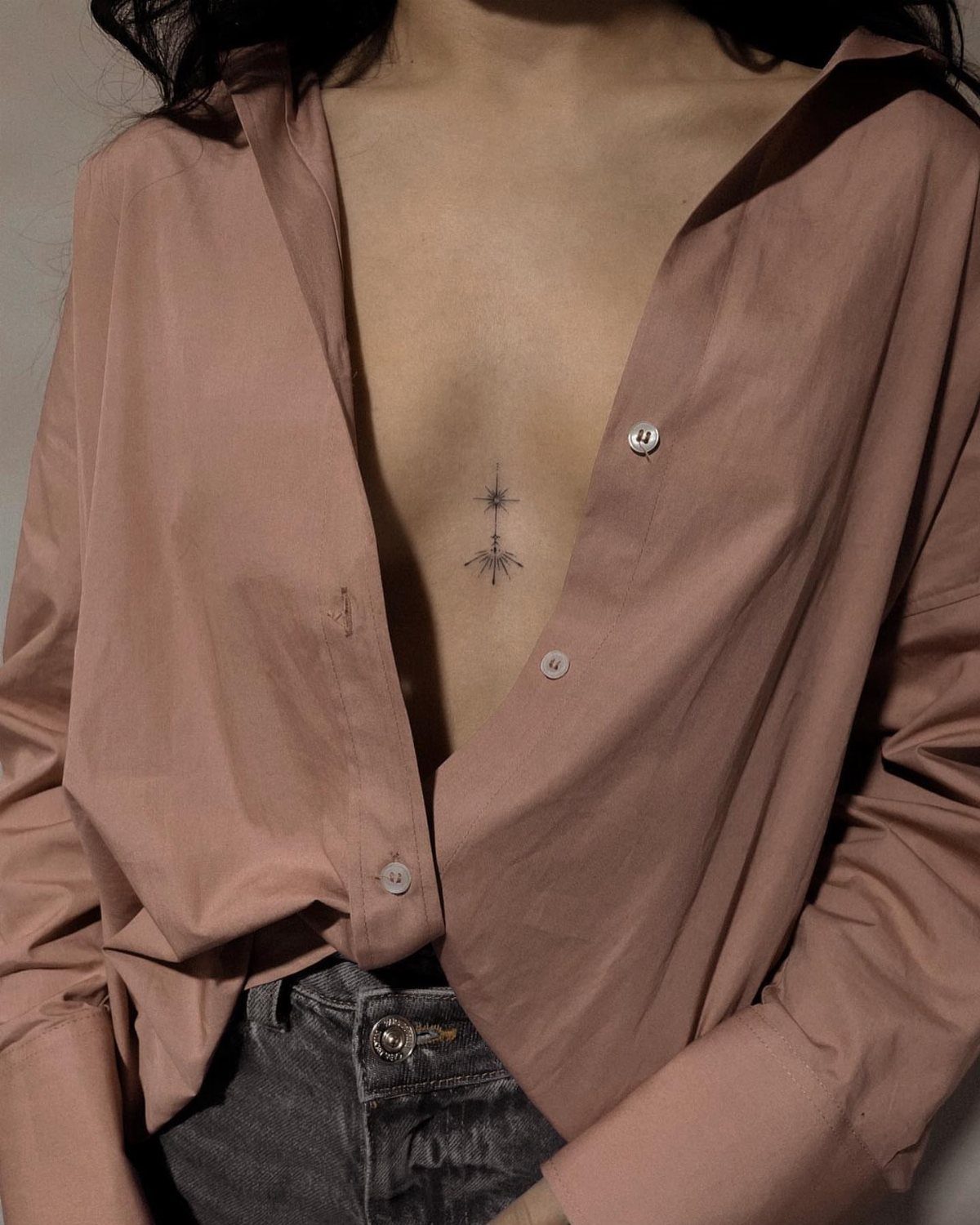
Vertical designs suit the narrow channel between the breasts in a way horizontal ones simply do not.
A starburst, a stem with buds, or a chandelier drawn top to bottom draws the eye along the body’s center line and makes the whole torso feel longer.
Pain runs 8/10 here, the highest of the three main chest zones.
The skin is thin and sits almost directly on bone, so the vibration travels. Schedule this for a day when you can lie flat without needing to shift, and bring a stress ball; gripping something helps more than you’d think.
The symmetry is unforgiving. My advice: find an artist who rigs a centerline with a string and measures twice before any ink touches skin.

What's included: 1 Set = 9 sheets henna tattoo stencils, template size: 21 cm x 12 cm/8.2" x 4.7" (Only Templates,No Tattoo Ink); Paste location: hand, finger, forearm, legs and other parts of the body
97 HENNA TATTOO DESIGNS IN 18 SHEETS:Includes 8 hand stencils, 8 rectangle flower pattern sheets, and 2 small pattern sheets. Features butterflies, flowers, roses, mandalas, paisley, and traditional Indian/Arabian mehndi designs. Perfect for creating stunning body art for weddings, festivals, and summer celebrations.

COMPLETE KIT: Set includes 18 sheets of self-adhesive henna stencils featuring traditional Indian Mehndi designs for hands and body art
3. Underboob Tattoos
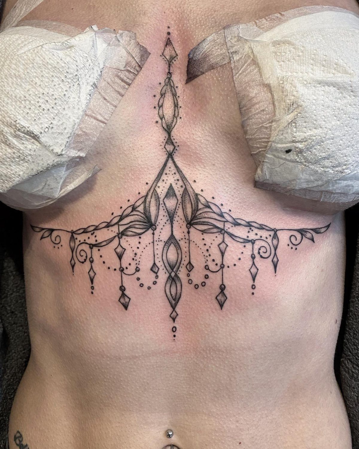
The curve beneath the breast is one of the few tattoo placements that remains genuinely private; standard shirts and blouses cover it completely, and it only shows in swimwear or deliberately low cuts.
That hidden quality draws a lot of women to it who work in conservative offices or answer to family members with opinions.
Mandalas, crescents, and ornamental chandeliers all follow that natural arc well. The pain rating sits around 7/10, slightly less than the sternum because some flesh cushions the needle in places, though the inner curve near the sternum still bites.
Healing demands planning: no underwire for 2 weeks minimum.
The wire rubs fresh ink, irritates the wound, and can leave blank spots where the pigment fails to set. Soft bralettes or going without work better during that window.

Flower Branch Tattoos for Women: There are 24 sheets 3D Black sexy and fresh with different designs tattoos in one package,each piece is 2.36*9 inch,including black sketch flower branch butterfly rose tattoos,which look sexy and mysterious,suitable for women who want to try fresh style and body art

12 Sheets Vine & Floral Temporary Tattoo: Get 12 sheets of elegant floral temporary tattoos featuring delicate vines, flowers, leaves, branches and wild plant line-art designs. A versatile collection for creating feminine, minimalist and realistic body art without the commitment of a permanent tattoo.

【Delicate Flower Design】This design set highlights minimalist floral vines drawn with clean black linework. The elongated shapes are perfect for legs, arms, knees, and collarbones, creating a graceful, modern look. Subtle yet expressive, these tattoos blend botanical beauty with a refined, contemporary aesthetic.
4. Upper Chest & Collarbone Tattoos
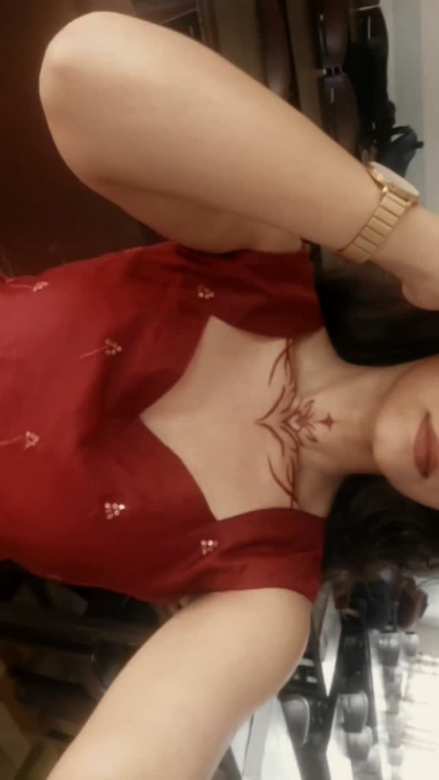
This zone frames the face the way a necklace does, and it interacts with real jewelry in ways lower placements cannot.
A line of script, a vine, or a small flock of birds extending toward the shoulder catches light on clavicle and chain alike.
At 5/10, the upper chest rates as the most manageable of the three main placements; there is actual muscle and fat between skin and bone here, and less nerve density than the sternum’s surface.
That relative comfort makes it practical for longer sessions or for anyone testing whether chest pain is something they can sit through.
I would choose this spot for words I wanted readable at conversation distance. The collarbone catches the eye naturally, so text here gets read without the viewer staring at your chest to decode it.

Compact and Reliable: The spring tool is lightweight yet sturdy, designed for easy handling and long-term use

This tool will allow you to align your armature bar and springs perfectly centered with ease. Designed to simplify the process of adjusting tattoo machine springs, ensuring optimal performance and delivering outstanding results.

Tattoo Machine Alignment Adjustment Tool for Spring Adjustment
5. Flowing Script Quotes

Words across the chest carry more weight than the same phrase on a wrist or ankle; the proximity to the heart is not metaphor alone, and the placement says the mantra matters enough to wear over your lungs.
Flowing script softens the effect and keeps a long phrase from reading like a stamp. Cursive that loops below the collarbone or trails toward the shoulder feels less like a label and more like a signature.
Match the slant to your natural posture; words that rise with your shoulder look forced if you habitually hold that shoulder low.
Pick a phrase you have lived with long enough to know it still means something on bad days.
Chest skin sees sun, sweat, and friction from bags and seatbelts, and touch-ups are harder here than on an arm you can reach yourself.

MADE IN THE USA SINCE 1990: For over 30 years Dynamic Color has produced professional tattoo ink in the United States, an established American brand artists built their work on long before most imported labels existed.

1.100% new brand and high quality. Color stability, pure color, durable and safe,with a formula containing a high concentration of pigment, long duration, make your tattoos have a great texture.

6. Abstract Shapes and Lines
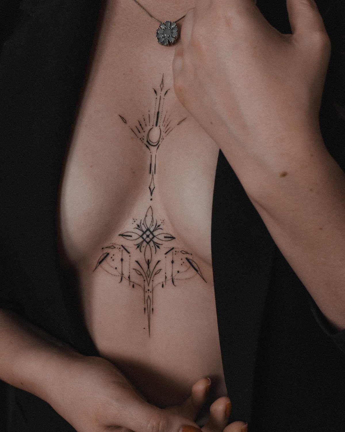
Fine geometric lines centered on the sternum read as contemporary jewelry rather than decoration, a quality that draws women who want ink without the traditional tattoo vocabulary of flowers, animals, or script.
The abstract approach demands precision. Asymmetry that might look intentional in a floral piece looks like a mistake here, so vet your artist’s portfolio for straight lines and consistent weight.
Ask specifically to see healed photos; fine lines spread more than bold ones, and results after the skin has settled separate the careful from the merely promising.
Black ink only, in my preference. Color abstracts on this placement carry their era with them, while black geometry from decades back still reads clean today.
Keep the design narrow enough that it does not distort when you breathe deep or bend forward; the sternum moves more than most first-timers expect.

Deluxe All-in-One Tattoo Kit:Includes 20 reusable tattoo stencils, 14 tattoo paste cones in 10 vibrant colors, tattoo paste mixing bottles, cotton swabs, and disposable gloves—everything needed for advanced DIY body art and color creativity.

【 761+ Fun Assorted Tattoo Stencils 】-The ChurlChurl tattoo stencils collection includes 761 high quality stencils with multiple themes. enjoy cute trendy tattoo stencil designs like butterflies, words, flowers, symbols, totem, Egypt style patterns and more.

24PCS Unique Henna Stencil Pack – This complete henna tattoo kit accessory set includes 24 sheets of reusable mehndi stencils (6.89" x 3.34"). Featuring exclusive designs like long arm bands, moon motifs, vine flowers, and large floral templates, it is ideal for creating DIY temporary skin art on wrists, arms, back, and full body.
7. Mandalas

A mandala on the chest works as a self-contained world, the circle holding its own edges where a floral piece might want to run off toward the shoulder.
The sternum and underboob arcs suit this best because the body’s own curves complete the design’s symmetry rather than fighting it.
Dotwork and stipple shading age more evenly here than solid black fill, which can pool and blur on the thin chest skin. The stipple technique also lets the artist adjust density gradually, softening where the mandala meets bare skin.
I would place the center point precisely on bone, not offset toward one breast. Even a half-inch shift reads as lopsided on a circular form, and the chest draws attention to any imbalance.

18 Sheets with high-quality 3 layers PVC henna hand stencils; Safe,Washable and Non-Toxic.Beautiful, Stylish, Easy to Use, Size: 21cm x 12cm/8.2" x 4.7"

PACKAGE INCLUDES - 56 Pieces different styles mandala stencils template. Multiple choices are provided for you.

COMPLETE KIT: Set includes 18 sheets of self-adhesive henna stencils featuring traditional Indian Mehndi designs for hands and body art
8. Dragonfly Tattoos

Dragonflies carry less baggage than butterflies, which is why more women in their thirties ask for them.
The insect’s structure, all wing and almost no body, lets an artist stretch the shape across collarbone or upper chest without the heaviness of a moth or bird.
Blue with small orange sparks works as a color pairing because the cool tone sits against warm skin while the orange picks up the undertone.
A single dragonfly, wingtip to wingtip no wider than your hand, reads as a landed moment rather than a spread pattern. Multiple small ones risk looking scattered unless an artist ties them with a flight line or wind suggestion.
Fine line suits this subject better than bold traditional. The wings’ veining demands hair-thin work, and a heavy hand turns transparent membranes into blue slabs.

【Multifunctional】This set of temporary tattoos adult women contains 18 stickers. The black floral realistic fake tattoos are perfect for women who want to explore different styles. The temporary tattoos for women measure 7.87 × 2.76 inches / 20 × 7 cm. These tattoo stickers for adults can be applied to the chest, shoulders, back, waist, abdomen, collarbone, etc., creating a fresh look.

⚡Awesome Realistic Flowers Temporary Tattoos for Women -- Super stylish design temporary tattoos, set includes variety of sizes that you can use for different locations on your shoulder, arms, chest, etc. Easy to share it with your family and friends.

【Floral Vine Collarbone Design】This dainty semi-permanent tattoos set features flowing floral vine designs with soft leaves and delicate blossoms, arranged to naturally follow the collarbone line. The fine, curved composition enhances body contours, creating an elegant and feminine look. Perfect for women and girls who love subtle, graceful tattoos for parties, vacations, or everyday styling with a refined floral touch.
9. Heart Tattoos
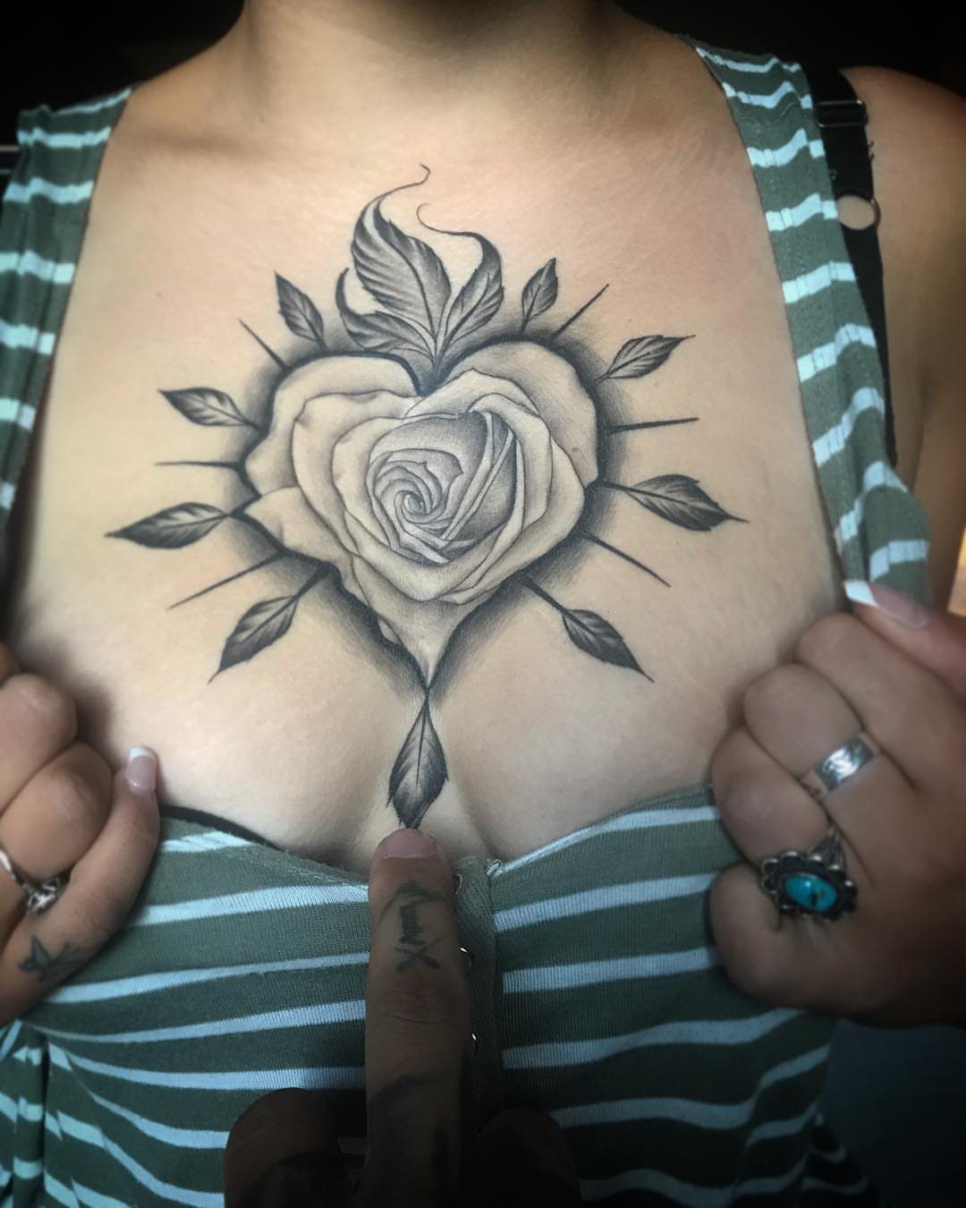
A heart-shaped rose solves the problem of literal hearts, which too often read as clip art. The rose’s natural cup already wants to be heart-like; an artist simply emphasizes the symmetry and adds the notch at top.
This placement, near the sternum with leaves spreading toward the underboob, uses the body’s center line the way the mandala entry describes. The rose’s weight sits low, drawing the eye down rather than pinning a badge at throat level.
Black and grey keeps the shape readable at distance; red or pink risks becoming a soft blur after a few years of sun and bathing suits.
A heart here is the most directly readable of chest symbols. Choose it when you want the meaning clear without explanation, not when you prefer a design that prompts questions.
Pain Levels
Sternum and upper-chest tattoos sit at opposite ends of the pain scale.
That gap matters for planning: the sternum’s thin skin over bone transmits vibration straight through the ribcage, while the upper chest’s muscle and fat layer dulls the sensation enough that longer sessions stay manageable.
Pain management is practical, not heroic. Dehydration and caffeine both amplify sensitivity, so water and a light breakfast beat an empty stomach and 2 coffees.
The underboob sits at a 7 out of 10, though that number flattens out fast once the needle moves inward toward the sternum, where the skin thins and the bone sits close.


Smooth: A homogenized carrier/pigment mixture that flows easily

Professional Tattoo Ink - Many of the most popular tattoo artists around the globe turn to World Famous' bold, beautiful tattoo ink, tattoo supplies & tattoo kits to deliver a flawless work of art.
Healing Tips
Sleeping on my back was non-negotiable that first week, which meant propping myself with pillows so I would not roll.
When the tattoo presses into sheets or the mattress pushes back against it, that thin healing film cracks and scabs lift before they are ready.
A travel pillow or stacked pillows behind your shoulders helps train the position if you usually sleep on your side.
Shower normally, but pat the area dry rather than rubbing. Loose, breathable tops beat tight synthetics that trap sweat against healing skin.
The chest sees more movement from breathing and arm motion than a limb tattoo does, so expect the tight, itchy phase to last a day or two longer than it did on your forearm or calf.
Cultural Significance
Chest placement carries historical weight across cultures. Ancient Egyptian women wore tattoos on the chest for protection believed to guard the heart, a placement tied directly to organ rather than ornament.
Across indigenous cultures, the chest has been marked for coming-of-age rituals, rank, or earned accomplishment, though who could see it and when shifted widely depending on the people and the gender of the one wearing it.
What persists is the placement’s intimacy.
Unlike a forearm or neck piece, a chest tattoo defaults to hidden; the wearer chooses when it becomes visible. That control draws women who want body art without professional consequence or public commentary.
The modern use follows this same privacy logic: memorials kept close to the heart, milestones marked on skin that moves with breath, reclaiming narrative without explaining it to strangers.
The chest’s cultural history is not decorative tradition but functional protection and personal threshold, a lineage that still fits how women actually use the placement now.
Frequently Asked Questions
What tattoos look good on the chest?
Flowing, organic layouts read best on the chest because the body underneath them moves.
Floral designs that stretch across collarbone and shoulder, vertical sternum pieces like starbursts or stems, and ornamental arcs beneath the breast all follow the body’s lines rather than fighting them.
Flowers and vines keep their shape longer when they weave together across the chest as one piece, rather than as a handful of tiny disconnected images that can smudge into each other as the skin moves.
What is a sternum tattoo?
A sternum tattoo runs vertically through the narrow channel between the breasts, drawing the eye along the body’s center line. Designs that suit this placement include starbursts, stems with buds, and chandeliers drawn top to bottom.
That center strip between the breasts scores an 8 out of 10 on the pain scale, topping the three main chest areas because the skin there is thin and the bone sits right underneath with almost no cushion.
Can I easily hide a chest tattoo for work?
Yes. Underboob and sternum tattoos sit completely invisible under standard shirts, blouses, and professional office wear.
They only show in swimwear, lingerie, or deliberately low-cut tops, which makes them a practical choice for anyone answering to family members with opinions or working in conservative offices.
Do chest tattoos hurt more than other areas?
The sternum runs 8/10, the underboob about 7/10, and the upper chest 5/10.
Will pregnancy ruin my chest tattoo?
Sternum and upper chest tattoos stay very stable through body changes.
An underboob piece may ride a little higher or lower if you gain significant weight or go through pregnancy, but a smart artist places it with that in mind so it still reads fine afterward.